How to Coordinate Lighting Colors for Outdoor Spaces
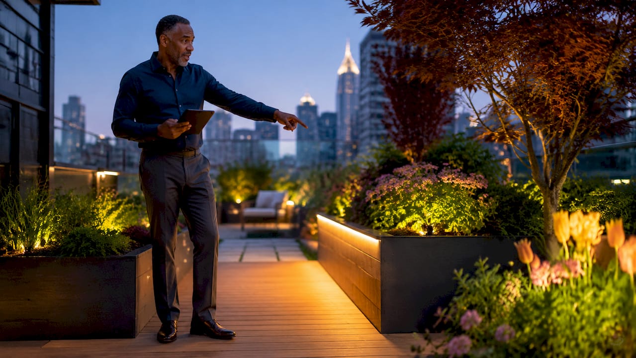
Coordinating lighting colors is defined as selecting and blending light sources so their color temperature, intensity, and hue work together to produce a balanced, visually cohesive environment. Get this right outdoors and your home’s architecture, landscaping, and hardscape all read as one unified design. Get it wrong and even expensive fixtures create visual noise. This guide covers the core principles of color temperature, layering, and harmony so you can make confident decisions for your property, whether you’re upgrading a single pathway or redesigning your entire exterior.
How to coordinate lighting colors: the essential principles
Color temperature is the starting point for every lighting decision you make. Measured in Kelvin (K), it describes the warmth or coolness of a light source. 2700K to 3000K promotes relaxation, while 4000K to 6500K promotes alertness. For outdoor residential spaces, warm tones in the 2700K to 3000K range create an inviting, grounded feel that complements most home exteriors and landscaping materials.
Beyond temperature, color harmony theory gives you a framework for choosing which hues work together. Three schemes apply directly to lighting design:
- Analogous schemes use colors that sit adjacent on the color wheel, such as warm amber and soft gold. These create smooth, unified looks that feel natural outdoors.
- Complementary schemes pair colors from opposite sides of the wheel, like warm white and cool blue. Complementary colors create vibrant energy but require careful balance to avoid overwhelming a space.
- Monochromatic schemes use a single hue at varying intensities. This is the safest approach for first-time DIY projects and produces clean, professional results.
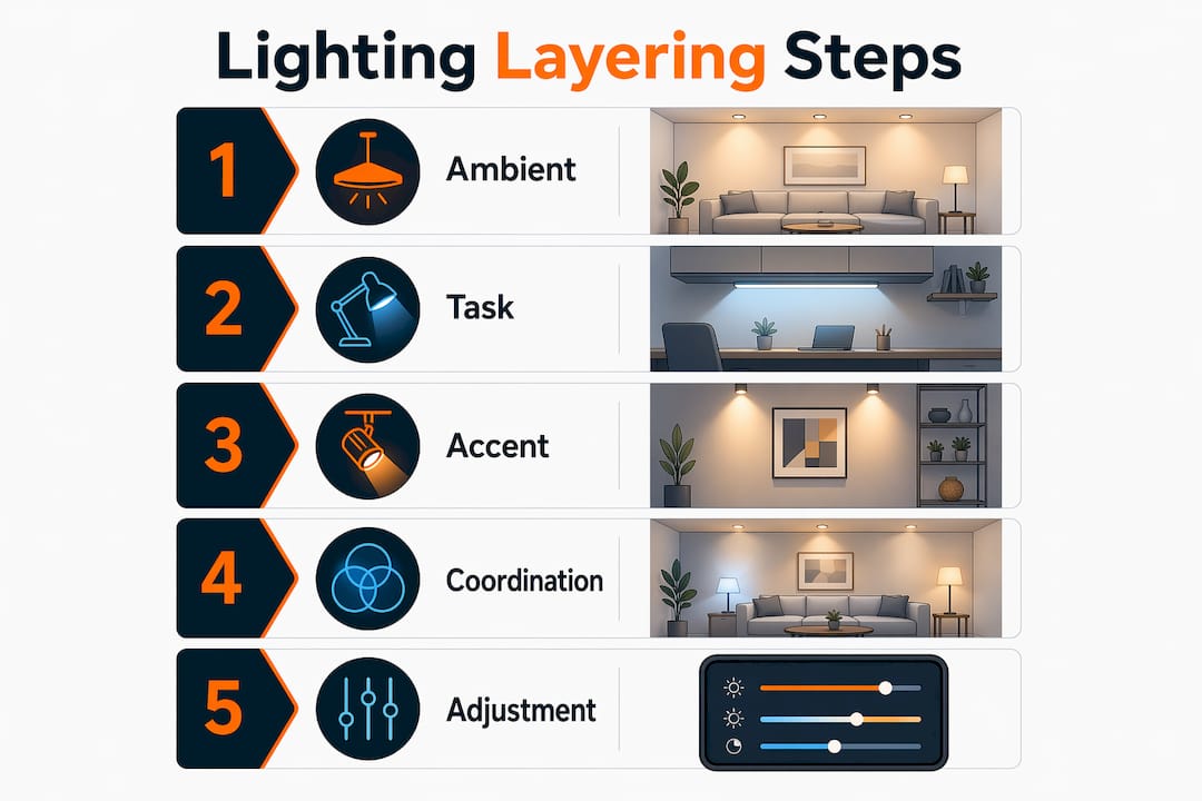
Layering is the third principle. Effective lighting design stacks three layers: ambient (general illumination), task (functional light for specific areas), and accent (decorative or architectural highlights). Most rooms require 3 to 5 distinct light sources, keeping color temperatures within 300K of each other to avoid visual chaos. That 300K rule applies outdoors too. A pathway lit at 2700K should not feed into a porch lit at 4000K without a deliberate transition.
Color Rendering Index (CRI) matters more than most homeowners realize. CRI measures how accurately a light source reveals the true colors of surfaces and plants. CRI 90 or above is essential for accurate color rendering. Low-CRI fixtures make brick look muddy and greenery look gray, which defeats the purpose of a well-planned color scheme.
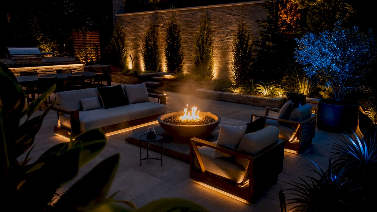
Pro Tip: Before purchasing any fixture, check both the Kelvin rating and the CRI. A warm 2700K bulb with a CRI of 75 will still make your landscaping look flat. Aim for CRI 90 or higher across every layer.
How to mix and match lighting colors without overwhelming your space
The most common mistake homeowners make is treating every fixture as an opportunity to add another color. More variety does not mean more visual interest. One dominant fixture color with one or two accent colors avoids overwhelming a space, and complementary accents work only when they are subtle.
A practical approach follows these steps:
- Choose your dominant temperature first. For most DFW-area homes with brick or stone exteriors, 2700K warm white is the anchor. It flatters earth tones and creates a welcoming glow without washing out architectural details.
- Select one accent color or temperature. A soft blue-white at 4000K on a water feature or modern facade element creates contrast without competing with your warm base.
- Test on the actual surface before committing. Lighting colors behave differently on physical textures. Brick absorbs warm light differently than painted wood or stucco. What looks balanced on a product photo or digital mockup may read completely differently on your home.
- Limit your palette to three sources maximum. Ambient wash, accent uplighting, and pathway lighting. Adding a fourth color source almost always creates clutter.
- Separate mixed temperatures spatially. If you want to use both 2700K and 3000K sources, separated placement allows blending without clashing. Placing them immediately adjacent creates a visible seam that reads as an error.
Finish combinations follow the same logic. Brass fixtures with bronze accents read as warm and cohesive. Matte black with brushed nickel reads as modern and clean. Mixing warm-finish fixtures with cool-temperature bulbs creates a disconnect that most people sense even if they cannot name it.
Step-by-step guide to layering lighting colors outdoors
Layering outdoor lighting colors requires you to assign each layer a specific Kelvin range and stick to it. Here is how the three layers break down for a typical residential exterior:
| Layer | Function | Recommended Kelvin | Placement examples |
|---|---|---|---|
| Ambient | General illumination, safety | 2700K to 3000K | Porch ceiling fixtures, wall sconces, soffit lights |
| Accent | Architectural and landscape highlights | 2700K to 3200K | Uplights on trees, facade wash lights, garden spotlights |
| Task | Functional areas | 3000K to 3500K | Garage entry, steps, outdoor kitchen work surfaces |
The key to making this table work in practice is keeping your ambient and accent layers within 300K of each other. A 2700K ambient layer pairs cleanly with 2900K accent uplighting. Jumping to 4000K for accent work on the same facade creates a split that looks unfinished.
For outdoor kitchens and entertainment areas, task lighting can run slightly cooler at 3000K to 3500K because those spaces benefit from the clarity that cooler light provides. The ambient lighting role in home settings is to set the overall mood, so that layer should always anchor the warmest temperature in your scheme.
Common mistakes to avoid in this step:
- Mixing 2700K pathway lights with 4000K flood lights on the same elevation. The contrast reads as a planning error, not a design choice.
- Using cool white (5000K or above) anywhere near living or relaxation areas. Warm amber light at 1800K to 2200K supports melatonin production and relaxation in evening settings. Cool light at 5000K triggers an alertness response that works against the mood most homeowners want outdoors at night.
- Ignoring the transition zones between your front yard, side yard, and backyard. Each zone should connect visually to the next through consistent temperature choices.
Pro Tip: Walk your property at night with a flashlight set to your target Kelvin if your phone supports it, or use a portable LED sample strip. Seeing the actual color on your surfaces before installation saves you from costly re-dos.
Troubleshooting common lighting coordination problems
Even well-planned schemes run into issues after installation. Here are the most frequent problems and how to fix them:
- Visual chaos from temperature mismatches. If your space feels unsettled or “off” without a clear reason, photograph it at night and compare the color of each fixture. Mixed color temperatures across layers lead to disjointed aesthetics. Replace the outlier fixture with one that matches your dominant temperature.
- Uneven brightness across zones. This is usually a lumens problem, not a color problem. Lumens measure actual brightness output. Match lumens across fixtures in the same layer so no single source dominates. Swapping to a higher-lumen bulb in a dim zone often resolves what looks like a color inconsistency.
- Flickering or color shifts on dimmable circuits. Non-dimmable LED bulbs fail faster and flicker on dimmer setups. Check that every bulb on a dimmed circuit is rated as dimmable. Mismatched dimmers and bulbs also cause color temperature to shift at lower settings, making warm whites look greenish or pink.
- Colors looking wrong on specific surfaces. Warm tones ground outdoor spaces more naturally than cool tones on most residential materials. If your warm-white uplight is making your brick look orange rather than rich amber, your CRI is likely below 90. Upgrading to a CRI 90 or higher source corrects this without changing the Kelvin rating.
- Glare near seating or entry areas. Glare is almost always a beam angle problem. Swap wide-beam flood fixtures for narrow-beam spotlights in areas where direct light hits eye level. The color scheme stays intact and the glare disappears.
What tools and smart systems make color coordination easier?
Smart LED systems remove much of the guesswork from color coordination by letting you adjust, preview, and save lighting scenes from an app. Philips Hue, LIFX, and Govee all offer tunable white bulbs that shift between 2700K and 6500K on demand. This means you can test your entire outdoor scheme at multiple temperatures before committing to a fixed setup.
| Tool / System | Key feature | Best use case |
|---|---|---|
| Philips Hue Outdoor | Tunable white and full color, app control | Accent and ambient layers with scene scheduling |
| LIFX Color | High CRI, no hub required, Wi-Fi native | Quick upgrades to existing fixtures |
| Govee Outdoor Lights | Affordable color control, music sync | Accent and entertainment zones |
| JellyFish Lighting | Permanent install, 16 million colors, professional control | Whole-home permanent color coordination |
Tunable white bulbs are the single most practical upgrade for homeowners who want flexibility. You set warm tones for evening entertaining and shift to a cooler, brighter output for security or task lighting without replacing any hardware. Scheduling features in apps like the Philips Hue app or the JellyFish Lighting controller let you automate these shifts to align with sunset and sunrise times.
For planning before installation, visualization tools like the Philips Hue app’s room planner or basic 3D rendering software let you map fixture placement and preview color combinations. Using advanced color spaces for digital planning prevents muddy blending results and produces more accurate previews of how colors will interact on real surfaces. For outdoor projects, pair digital planning with physical sample testing on your actual materials before finalizing any fixture order.
Dfwledpro installs JellyFish Lighting systems that give homeowners access to 16 million color combinations through a dedicated app, with professional placement calibrated to each property’s specific architecture and landscaping. That level of control makes best practices for LED lighting far easier to execute consistently across a full exterior.
Key takeaways
Effective lighting color coordination requires anchoring every layer within a 300K temperature range, choosing CRI 90 or higher sources, and testing colors on actual surfaces before committing to a final scheme.
| Point | Details |
|---|---|
| Anchor with one dominant temperature | Choose 2700K to 3000K as your base for most residential exteriors to create warmth and cohesion. |
| Stay within 300K across layers | Ambient, accent, and task lighting should not exceed a 300K spread in any single zone to avoid visual clutter. |
| Prioritize CRI 90 or higher | Low-CRI sources distort surface colors and undermine even a well-planned Kelvin scheme. |
| Test on real surfaces | Digital previews do not account for how brick, stone, or siding absorbs and reflects light. Always test physically. |
| Use tunable white for flexibility | Smart systems like Philips Hue or JellyFish Lighting let you adjust temperature without replacing hardware. |
Why restraint is the most underrated lighting skill
After working with homeowners across the DFW area on permanent LED installations, the pattern I see most often is this: people add more colors thinking more variety means more impact. It almost never does. The installs that get the most compliments from neighbors and the most satisfaction from homeowners are the ones built around one strong temperature, one deliberate accent, and clean transitions between zones.
The other thing I have seen consistently is that homeowners underestimate how much surface material changes the result. A 2700K uplight on a cream-colored stucco facade looks completely different from the same fixture on dark red brick. You cannot skip the physical test. No app, no product photo, and no showroom demo replicates what your specific exterior does with a given light source at night.
67% of lighting professionals find color selection the most technically challenging part of creating cohesive schemes. If professionals struggle with it, homeowners should not expect to get it right purely from reading specs. The solution is not more research. It is fewer colors, better placement, and one round of physical testing before the final order.
The homeowners who get the best results treat lighting coordination the same way a good painter treats color selection: pick fewer choices, test them in context, and commit fully once you have confirmed they work together.
— Adrian
Transform your outdoor lighting with Dfwledpro and JellyFish
If you want a permanent outdoor lighting system that puts full color coordination control in your hands, Dfwledpro is the authorized JellyFish Lighting dealer for the Dallas-Fort Worth metroplex. We serve Arlington, Fort Worth, Mansfield, Grand Prairie, Burleson, and 30 more DFW communities with professional installation calibrated to your home’s specific architecture and landscaping.
JellyFish Lighting systems offer 16 million color combinations, app-based scene control, and a lifetime warranty on the fixtures. Whether you need permanent LED lighting for your home exterior or a commercial LED solution for a business property, Dfwledpro handles design, installation, and ongoing support. Contact us to schedule a free consultation and see how a professionally coordinated lighting scheme changes the way your property looks after dark.
FAQ
What color temperature is best for outdoor residential lighting?
2700K to 3000K is the standard recommendation for outdoor residential lighting. This range creates warm, inviting light that complements most brick, stone, and wood exteriors without washing out architectural details.
Can you mix 2700K and 3000K lights outdoors?
Yes, with careful placement. Mixing 2700K and 3000K works when the two sources are not placed immediately adjacent to each other. Separated placement allows the temperatures to blend naturally rather than clash at a visible seam.
What is CRI and why does it matter for lighting color coordination?
CRI (Color Rendering Index) measures how accurately a light source reveals the true colors of surfaces and materials. A CRI of 90 or above is the standard for spaces where color accuracy matters, including outdoor areas with landscaping, brick, or painted surfaces.
How many light sources should I use per outdoor zone?
Most outdoor zones benefit from 3 to 5 distinct light sources, with all sources kept within a 300K temperature range. Using fewer sources with higher quality placement produces better results than adding more fixtures at mismatched temperatures.
Do smart lighting systems actually help with color coordination?
Smart systems like Philips Hue, LIFX, and JellyFish Lighting simplify coordination by letting you preview, adjust, and save color scenes before committing to a fixed setup. Tunable white bulbs in these systems let you shift temperature without replacing hardware, which is the most practical flexibility a homeowner can have.